

Hi folks, hope you are doing well. In this post, I am going to share with you some tips that I personally use while making websites responsive.
1. Padding/Margin - We usually use a lot of padding when we make websites for desktops, to make them more attractive. While making it responsive for mobiles, tablets try decreasing the existing paddings and margins.
2. Use em/rem/ percentages - Always try using em/percentage/rem instead of px, so that the text, images size adjust with respect to the device width.
3. Flex-wrap - Using flexbox to align your HTML elements such as <div>,<p> etc provides the force elements onto one line or can wrap onto multiple lines according to their width.
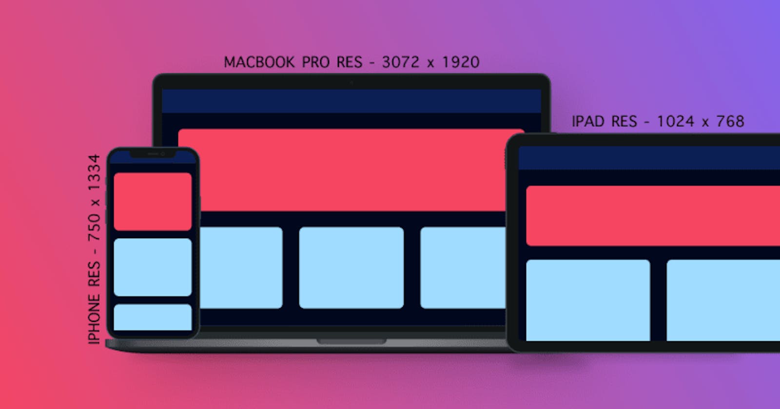
4. Media query - Media query should be used to set width and height according to the breakpoints. Breakpoint refers to the width at which the website starts looking distorted.
5. Box-Sizing - It resolves a lot of problems padding causes, using box-sizing on HTML elements with a percentage width will take padding into account rather than having to adjust the width due to padding.
{box-sizing : border-box;}
If you know of other tips/tricks, let me know in the comments. Thanks for reading :)
Connect with me on -